
.png)
.png)
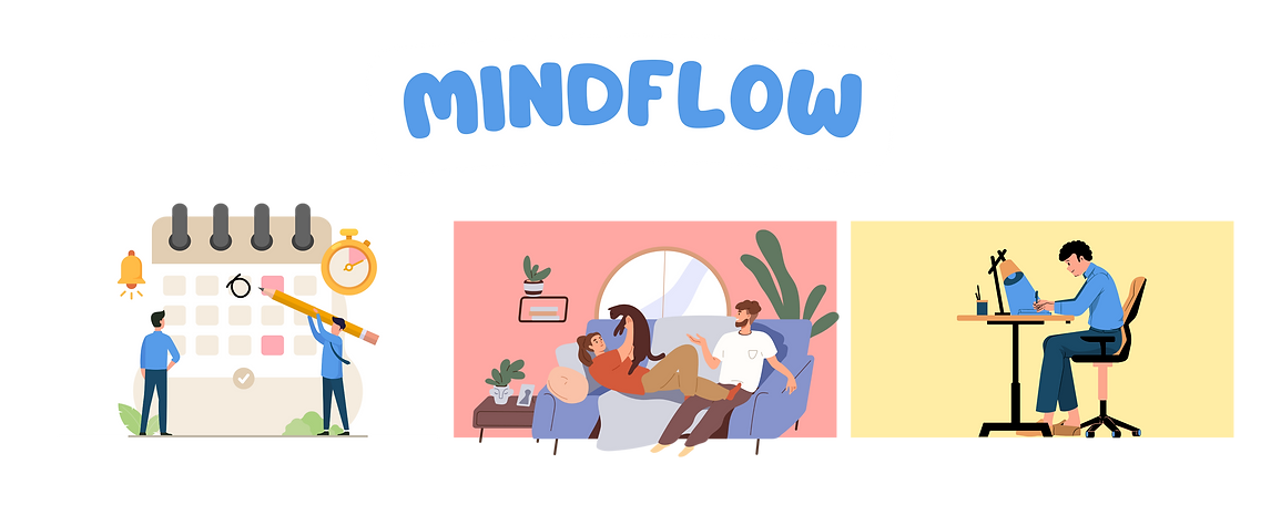
You deserve control of your mental wellness.

Mindflow is a user-centric app designed to help university students recognize and tackle burnout, promoting a culture of proactive mental wellness through engaging self-care strategies. Utilizing empathetic UX design principles and a clean, intuitive UI, Mindflow seamlessly integrates into students' daily routines, providing an accessible platform for mental health self-assessment and management.


.png)
_edited.png)

We kicked off our design process with an expansive whiteboard session, leveraging the collaborative online tool Miro to capture a flurry of ideas in one visual landscape. This initial brainstorming phase is deliberately unstructured, encouraging the free flow of concepts and considerations, all visibly documented on a digital canvas. Such whiteboard sessions are a fundamental UX process, providing a critical, open platform to unpack and explore everything! It's an essential first step that ensures we start our design journey with a comprehensive view of potential directions and user needs.
During our whiteboard brainstorming, we sought inspiration by reviewing resources like Reddit, known for its straightforward, content. This allows us to gather diverse, real-world insights that inform our app's design. Reddit's discussions provide raw, unbiased accounts of mental health struggles, an invaluable asset for authenticity. However, we also recognize the platform's open nature as a potential flaw, as it allows unvetted experiences to influence our perspective.
We chose to concentrate on the student demographic because it reflects our own experiences, allowing us to draw from personal insights and fostering a deeper connection to the challenges and solutions within this group.
.png)
POTENTIAL IDEAS
INSPIRATION AND RESOURCES

WHO CAN WE HELP?
WHAT TRIGGERS MENTAL HEALTH DECLINE?
A state of emotional, physical, and mental exhaustion caused by prolonged stress. It occurs when someone feels overwhelmed, emotionally drained, and unable to meet constant demands.
We decided to focus on burnout to proactively identify and mitigate the early signs of mental health decline, addressing the gap in current applications that typically respond to mental health issues post-occurrence, whereas burnout often serves as a significant early indicator.
COLORS OF MENTAL WELLNESS
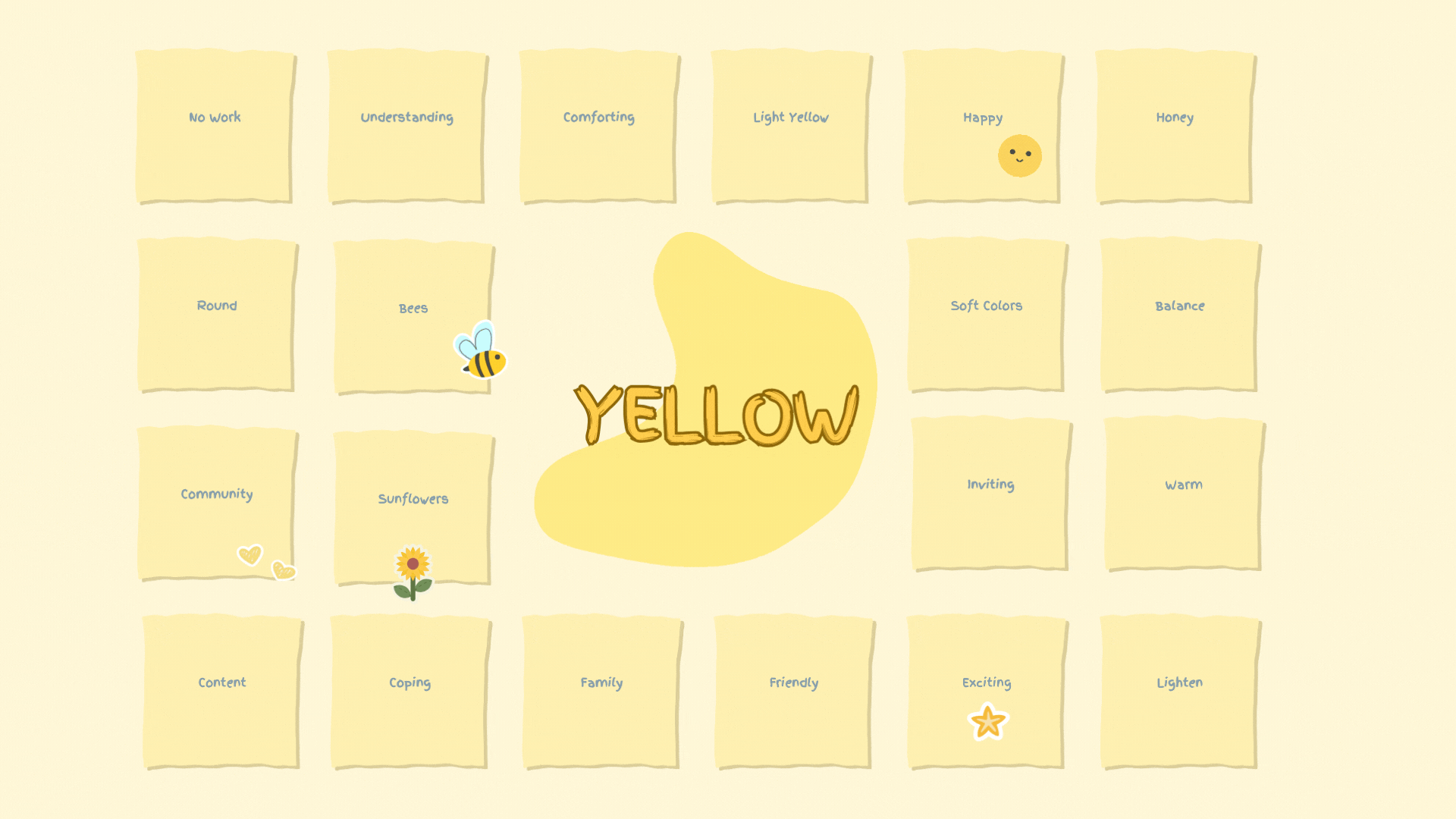

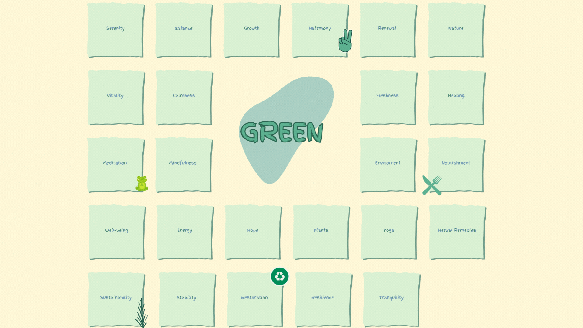
In my initial whiteboarding sessions, I found that selecting colors related to mental wellness is fundamental due to their deep psychological impact. Choosing appropriate shades can significantly enhance the usability of an interface, making the user's interaction with our application not just intuitive but also emotionally supportive. Initiating this phase early in our design process allows me to establish an aesthetic foundation that not only appeals visually but also offers a therapeutic touchpoint for users.
We chose blue, yellow, and green for their strong associations with mental wellness—blue for its calming presence, yellow for its uplifting energy, and green for its connotations of growth and balance—all of which are integral in the context of preventing burnout. These colors harmonize to create a visual environment that supports the user's mental health journey.
.png)
_edited.png)
.png)
Competitor Analysis
-
Comprehensive market analysis highlighted a gap in apps like BetterHelp, Talkspace, and UCSD MyChart, which don't primarily focus on student burnout prevention.
-
Competitor applications often come with high costs and may not cater to the unique challenges faced by university students.
-
Students experiencing burnout often seek support from friends and online forums, underscoring the need for a dedicated solution.
.png)
.png)
.png)
.png)


.png)
Initial Sketches
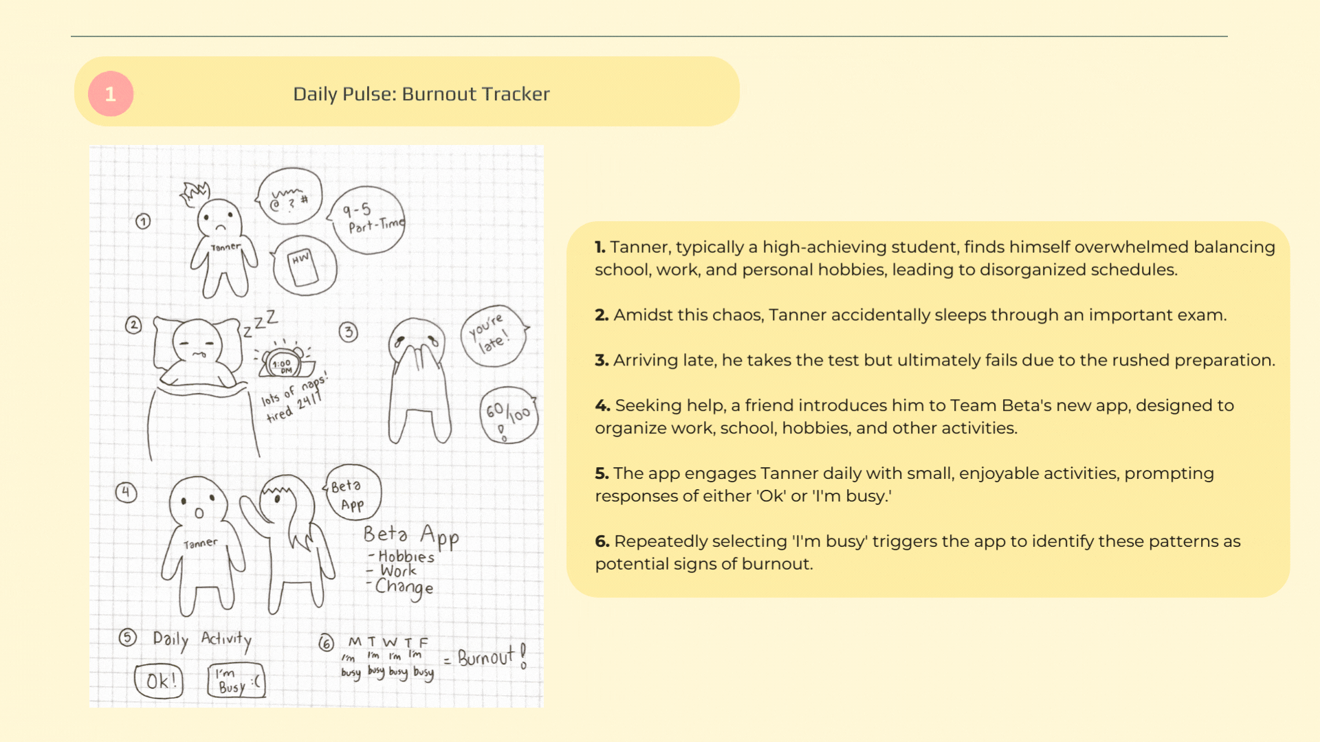
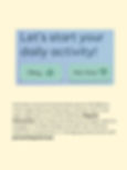
In our initial sketches for the application, we focused on a proactive approach to mental wellness, emphasizing early detection and management of burnout. The app's design is geared towards maintaining a user's mental health by tracking their daily activity patterns and identifying inconsistencies that may signal burnout.
-
Tracks daily user activity to identify burnout patterns.
-
Mandates phone number verification for the addition of emergency contacts for user safety nets.
-
Notifies users personally after two activity lapses; alerts contacts after four.
-
Connects users to mental health resources, aiding in burnout management.
.png)
.png)

From our initial sketches, we progressed to crafting a low-fidelity prototype to outline the app's structure. Low-fi prototyping is essential and allows for early iteration and concept validation without extensive detail. I utilized Figma for this phase, creating a clear blueprint to refine before advancing to detailed design and applying a style guide.

.png)
.png)
We curated a collection of images that evoked tranquility, balance, and focus, assembling a moodboard that truly reflected our vision. The colors extracted from this moodboard were then distilled into a cohesive color palette. This palette served as a guiding beacon for the visual language of our app, ensuring that every element resonated with the theme of mental well-being.
.png)
.png)
_edited.png)
_edited.png)
.png)
.png)
.png)
.png)
.png)
.png)
.png)

User Setup serves as the initial touchpoint where users input their details, creating a foundation for a personalized app experience. This phase is crucial for tailoring Mindflow's features to each individual, ensuring the app's recommendations and alerts are relevant and effective. By understanding the user's context, the app can better align its functionalities with their specific needs and preferences.
.png)
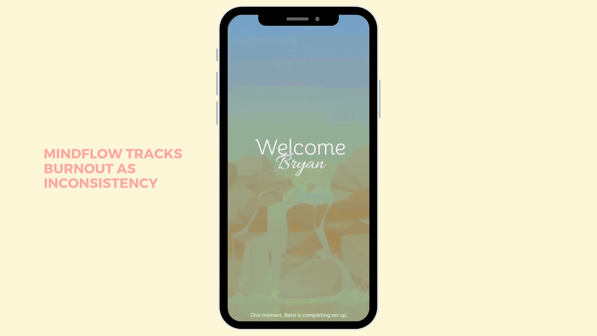
Mindflow is designed to familiarize users with the app's information architecture, guiding them through the various functionalities and features available. This stage provides a comprehensive overview of the app's layout, including how to navigate through different sections such as activity tracking, progress reports, and wellness resources.

.jpg)
.jpg)
.png)
.png)
USER
TESTING
Revisiting Personas
Integrating User Stories into the Final Design
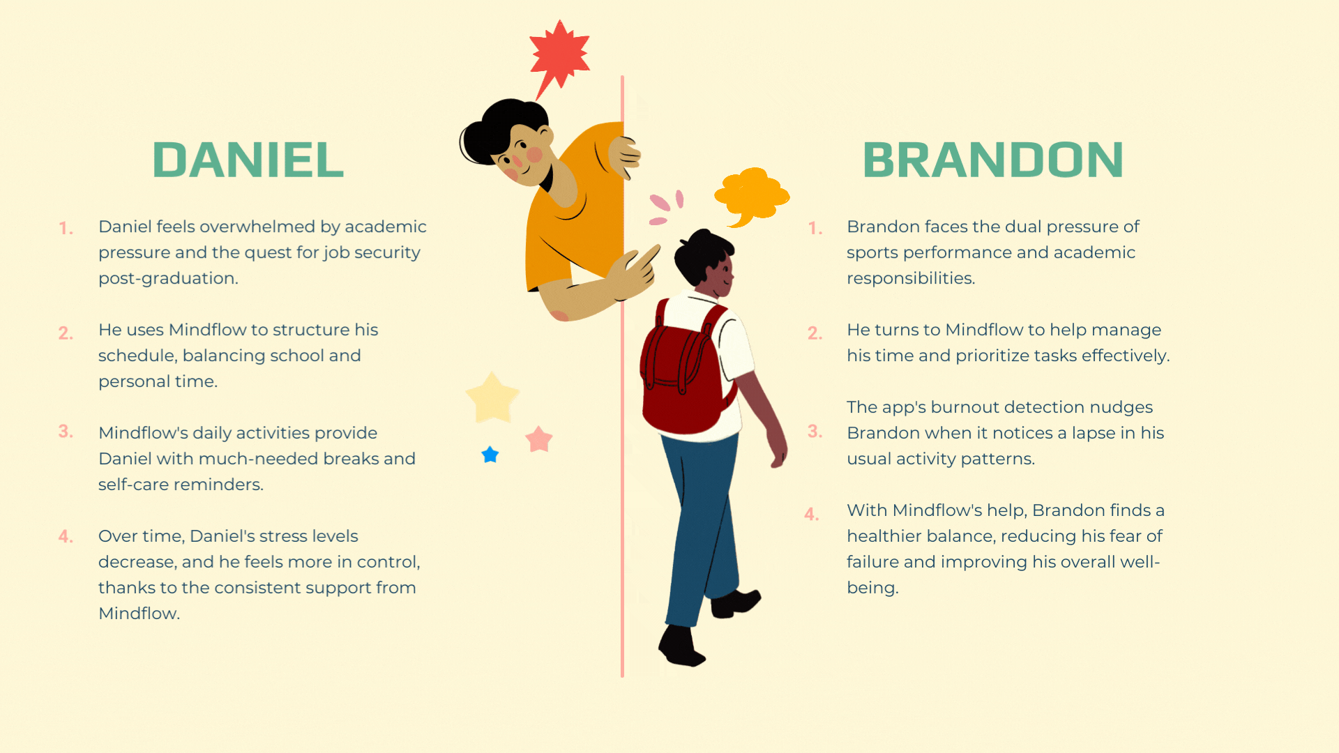
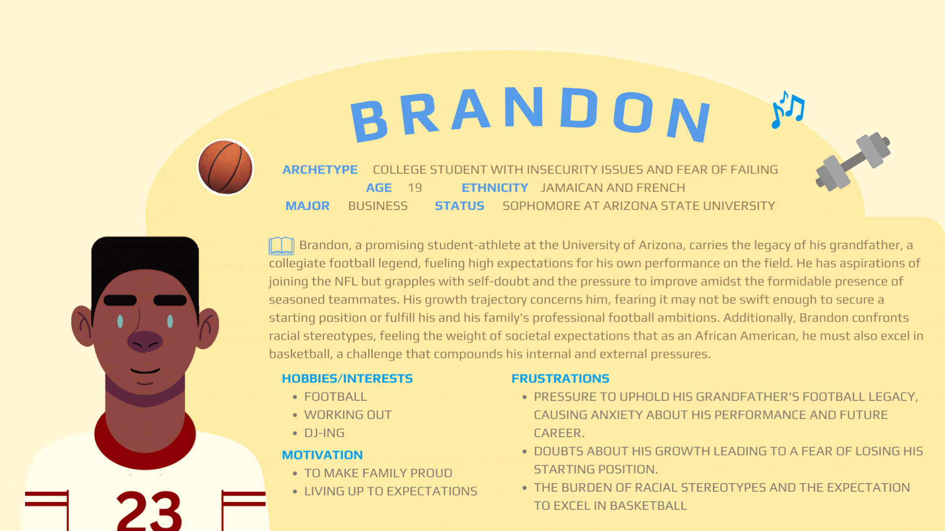
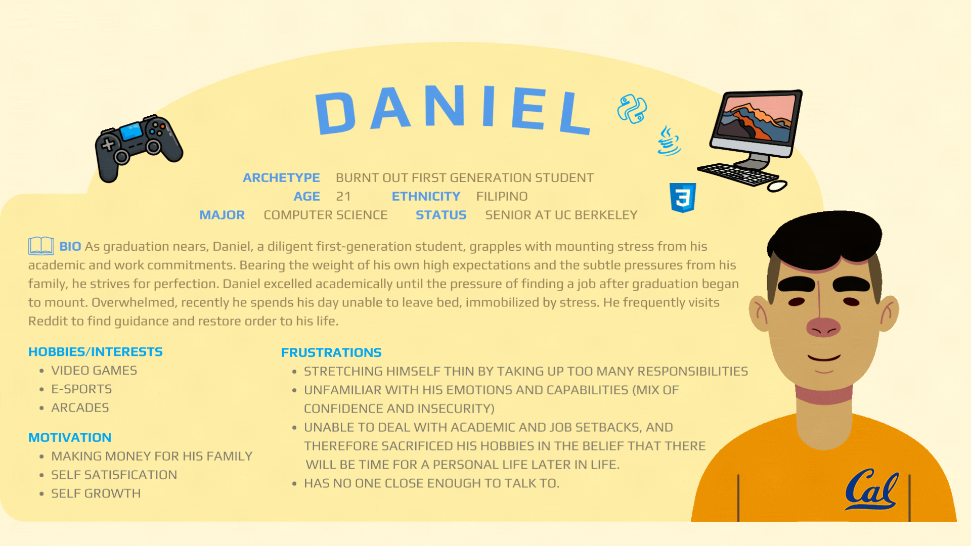
Revisiting personas is an essential UI/UX practice that ensures the final product remains user-centered and aligned with the target audience's needs. By reflecting on the personas of Daniel and Brandon, I can better understand how Mindflow meets its unique challenges, thus validating our design solutions and demonstrating empathy throughout my design process.
.png)
.png)
In this project, I've gained a deeper appreciation for the nuanced needs of students dealing with burnout. The iterative design process, informed by user feedback, taught me the importance of flexibility and the willingness to pivot when necessary. Although the final design has been well-received, there are opportunities for improvement, particularly in streamlining the onboarding process and enhancing the activity tracking feature to cater to a broader range of hobbies and interests. This project has sharpened my skills in empathetic design and will undoubtedly shape my approach to user-centric solutions going forward. Looking ahead, I see great potential in exploring adaptive AI integration within Mindflow to further personalize the user experience.
Given more time beyond our design sprint constraints, I would have delved deeper into the following three critical areas with my team if we were to revisit Mindflow.
.png)
.png)
.png)
.png)
.png)